Pivot Tables are one of the most powerful and time-saving features in Microsoft Excel. They help you quickly summarize, analyze, explore, and present large amounts of data without writing any complicated formulas.
With just a few clicks, you can turn thousands of rows of messy data into meaningful and interactive reports.
In this guide, we’ll cover:
- What a Pivot Table is
- How to create one step by step
- The most common tasks you can do with Pivot Tables
- Practical examples you can try
What is a Pivot Table?
A Pivot Table is a reporting tool in Excel that helps you:
- Summarize numbers – totals, averages, counts, maximum, minimum.
- Group data – by categories (e.g., months, years, departments, products etc)
- Compare values – across rows and columns.
- Filter and drill down – to see details instantly.
Example: If you have a sales dataset with thousands of rows, a Pivot Table can instantly show:
- Total sales by region.
- Average sales per employee.
- Top 5 customers by revenue.
Without Pivot Tables, you’d have to use many formulas and spend a lot of time cleaning up.
Creating a Pivot Table – Step by Step
We’ll use this small dataset as an example:

Step 1: Select and Insert a Pivot Table
- Select your data range (A1:F12).
- Go to the Insert Tab on the Ribbon.
- Click PivotTable.

- Select From Table/Range option.
- In the dialog box, choose whether you want the Pivot Table in:
- A New Worksheet (recommended for beginners).
- The Existing Worksheet (if you want it beside your data).

- Click OK.
Now, Excel creates a blank Pivot Table on your chosen sheet.
Step 2: Pivot Table Field List
On the right side, you’ll see the Pivot Table Field List. It has four main areas:
- Filters → Apply overall filters to the entire report.
- Columns → Data you want shown across columns (e.g., Month, Region).
- Rows → Data shown in rows (e.g., Employee, Department).
- Values → The numbers you want to calculate (e.g., Sales, Targets).
Think of this like a control panel – you drag and drop fields into these boxes to design your report.
Step 3: Build Your First Pivot Table
Let’s create a simple report:
- Drag Department to the Rows area.
- Drag Sales to the Values area.
Result: You’ll instantly see Total Sales by Department.

No formulas, no effort – Excel did the heavy lifting.
Common Pivot Table Tasks (Explained Simply)
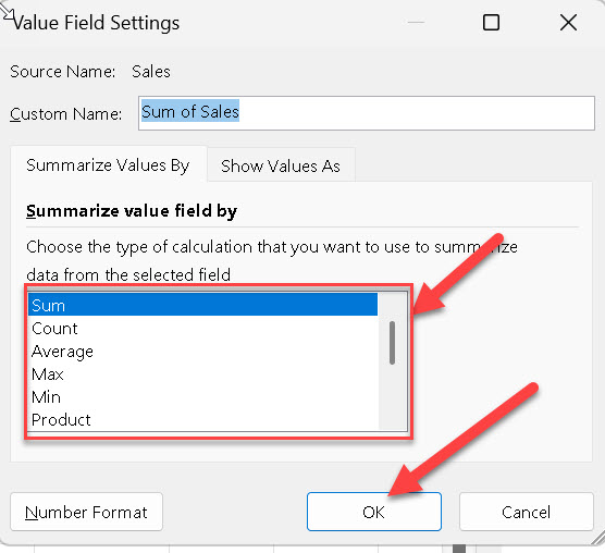
1. Summarize Data
By default, Excel sums up numbers in Pivot Tables. But you can change it:
- In the Pivot Table Field List, look under the Values area.
- You’ll usually see something like Sum of Sales. Click the drop-down arrow next to it.
- Select Value Field Settings Option.

- Choose:
- Sum – total of values (default).
- Average – average per group.
- Count – number of records.
- Max/Min – highest or lowest value.
Example: Show the average sales per department instead of the total.

2. Group Data in Pivot Tables
One of the best features of Pivot Tables is that you don’t need to manually rearrange your data. Excel can automatically group your data into categories like months, years, number ranges, or even custom groups.
Here’s how grouping works:
Grouping Dates:
If your dataset has a date column (like “Join Date” or “Month”): Here we have a month column which represents the sales month.
1. Create a Pivot Table and drag the date field (e.g., Month) into Rows.

2. Right-click on any date in the Pivot Table.
3. Select Group from the menu.

4. Choose how you want to group:
- Days
- Months
- Quarters
- Years
5. Click OK.

Example: If you have daily sales data, you can group it by Months to see total sales for each month, instead of hundreds of daily rows.
Grouping Numbers
If your dataset has numbers (like Sales, Score, Age, or Salary):
1. Drag the number field into Rows (or Columns).
2. Right-click any number in the Pivot Table.
3. Select Group.
4. Enter the range size (e.g., group sales into 10,000 steps).
- Start at 0.
- End at 100,000.
- By 10,000.
5. Click OK.

Example: Instead of showing every single sales figure, you’ll see groups like:
- 0–50,000
- 50,001–100,000
- 100,001–150,000

This makes your report neat and easy to read.
Grouping Text (Categories)
Sometimes you may want to manually group text items.
1. Drag the Department field into Rows.
2. In your Pivot Table, select the text items (e.g., “HR” and “Finance”).
3. Right-click → Choose Group.

4. Excel will create a new group (you can rename it, like “Support Staff”).
Example: You can group “HR” and “Admin” into one category called Support, while keeping other departments separate.

Pro Tip: Grouping makes reports more readable because it turns detailed data into higher-level summaries (like months instead of dates, or ranges instead of individual values).
3. Apply Filters and Slicers
Filters and slicers help you focus on specific parts of your data without changing the entire Pivot Table.
Using Filters:
1. Drag the field you want to filter (e.g., Region) into the Filters area of the Pivot Table.
2. A filter box will appear above the Pivot Table.

3. Click the dropdown → Select one or more items (e.g., choose East only).

4. Pivot Table updates instantly to show only the filtered data.
Example: You can view sales for East Region only by applying a filter.

Using Slicers
Slicers are like buttons that let you filter data with a single click.
1. Click anywhere inside the Pivot Table.
2. Go to Insert Tab → Slicer.

3. Select the field you want (e.g., Month or Employee).

4. A slicer box with buttons will appear.
5. Click a button (e.g., Anirudh) → The Pivot Table instantly shows data for that selection.

Example: Instead of opening dropdown filters, you can just click Jan, Feb, Mar in the slicer to see data month by month.
4. Show Data as % or Ranking
Instead of just showing totals, Pivot Tables can calculate percentages and rankings automatically.
Show as % of Total:
1. Right-click on any value in the Pivot Table.
2. Select Show Values As → % of Grand Total.

3. Now, instead of raw sales, you’ll see each department’s sales as a percentage of the company’s total.

Example: If Marketing sales are 2,50,000 and total sales are 7,15,000, the Pivot Table shows 34.97%.
Show as Rank:
1. Right-click on a value.
2. Choose Show Values As → Rank Smallest to Largest (or Largest to Smallest).
3. Select the base field. Here im selecting Department.
4. Excel assigns a ranking automatically.
Example: If Operation department has the highest sales, thatwill be ranked 1, and the lowest performer may be ranked 6.
5. Sort and Drill Down
Sorting and drilling down helps you dig deeper into the details.
Sort Data:
1. Right-click on a value (e.g., Sales).
2. Choose Sort → Largest to Smallest (or Smallest to Largest).

3. Pivot Table rearranges rows or columns based on the sort order.

Example: You can instantly rank departments from highest sales to lowest sales.
Drill Down (See the Details)
1. Double-click on any number in the Pivot Table.
2. Excel will open a new sheet showing the raw data that makes up that number.

Example: If Sales for East = 130,000, double-click it. You’ll see all the rows from your dataset that belong to the East region.
Formatting a Pivot Table
A clean design makes reports professional.
- Go to PivotTable Tools → Design Tab → Choose a built-in style.

- Right-click numbers → Number Format → Apply currency, percentage, or custom format.


- Add Conditional Formatting → Highlight top sales, low performance, or specific trends.
Example: Color all sales above 80,000 in green and below 50,000 in red.
Advantages of Pivot Tables:
- Save hours of manual work.
- No need to write formulas.
- Summarize huge data in seconds.
- Drag-and-drop flexibility.
- Great for dashboards (with slicers and charts).
Limitations of Pivot Tables
- Your source data must be clean and structured (no blanks, merged cells).
- With extremely large datasets, Excel may slow down.
- For advanced calculations, you may need Power Pivot or Power BI.
Example Reports You Can Create:
- Sales by Region and Month.
- Employee Performance vs. Targets.
- Department-wise Expense Summary.
- Customer Purchase Analysis.
Pivot Tables are an essential Excel skill for students, professionals, and business users. They give you instant insights and save you hours of manual effort.
Start with a simple Pivot Table (like Sales by Department). Then, explore grouping, slicers, percentages, and rankings to unlock their full power.
If you practice with real data, Pivot Tables will quickly become your favorite Excel tool.